-2.png)
Introduction
Logos can range from stoic and boring to wild and wacky. In the finance field however, companies typically aim to have their logos come across serious, strong, and trustworthy. A clown wearing a multicolour hat may be fun, but it doesn't exactly convey the message "you can trust us with your money". So, for your benefit and enjoyment, here are the some of the best 5 logos from financial companies which we have corralled all in one place for you.
![]()
1) Prudential
Prudential's motto and logo match up amazingly well. Their motto is "Let Prudential be your rock", and pairing this motto with a cliff/rock face shows their strength, durability and endurance. The message they are conveying to clients or potential clients is that they are stable and steady. When looking for a place to put your money, wouldn't that be exactly what you're looking for too?
![]()
2) American Express
American Expresses' new logo may seem super simple and almost bland, but their revamp is actually ingenious. If you take the time to search up a comparison of their old and new logos online, you'll see that their revamp doesn't seem different from their old logo at all. Sometimes it only takes a minimal change to make a huge difference. The biggest change that occurred in this logo is that it became mobile friendly, and came with a smaller version to be used for social media. It's also a little bit bolder, clearer, and simpler, without losing that iconic blue square.
![]()
3) Chase
Chase's symbol may at first glance appear meaningless, but if you take the time to look into it, you'll see a whole lot more depth not found upon initial sighting. Their blue geometric pattern actually represents money flow. Not only that, but the blue colouring has been shown to bring about feelings of safety. This logo says "let your money flow to us, and we will protect it".
![]()
4) Bank of America
Bank of America's name and logo draws on its country's patriotism. This remaking of the American flag is tying the banks values to American values. The rectangles are also meant to symbolize a farmers field, which goes straight to the heart of their main clients: farmers. Lastly, as mentioned above, blue symbolizes safety, and evokes trust.
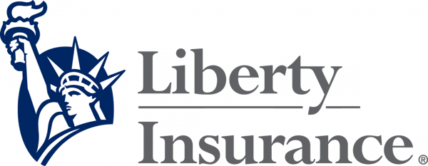
5) Liberty Mutual
Here is another instance of the use of patriotism. This time instead of catering to farmers, it caters to the idea that the main values of Americans are the main values of most people interacting with this insurance company: liberty, and freedom of choice when it comes to your money.
Conclusion
A logo gives out a certain energy which represents the company. It can be very hard to come up with a creative idea, however when you do it'll stick with you until the end of your company's run. You may not need to redesign your logo, but it's always a good idea to draw inspiration and knowledge from the industry's top players.


.png)