If you’re looking for inspiration on websites for financial advisors you’ve come to the right place.
We design and launch 100’s of new sites on our platform each year and we’ve rounded up a few of our favourites. Read on to find out what made them top our list!
As a financial advisor in today’s digitally competitive world, a well designed and strategic website is the central piece and key component to your overall digital marketing strategy. It’s imperative that your website is performing well and working for you 24/7; ensuring that you don’t miss out on prospects and are continuing to delight your customers. A poorly designed website can sabotage your efforts and turn a potential client away.
So what makes a financial advisor’s website great? At its core it serves its purpose; converting leads and engaging with your existing clients. All of the websites on our top 10 list have the following in common:
- Provide relevant business information for its audience (get to the point!)
- Communicate what’s unique about the business (tell them what makes you stand out!)
- Build trust through its content (demonstrate your expertise!)
- Encourage the visitor to get in touch (help convert leads from cold to warm!)
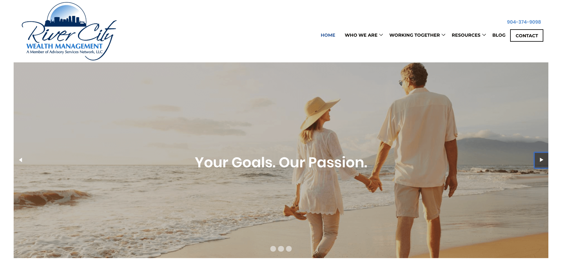
River City Wealth Management
Simplicity is key. The clean layout and minimal top navigation make this website one of our favorites. The copy is well written and straightforward, providing the user all the details they need without getting off track. The phone number and ‘Contact’ button is highlighted on the main menu and a contact form is embedded in the footer, ensuring it won’t be missed by a prospective new client.
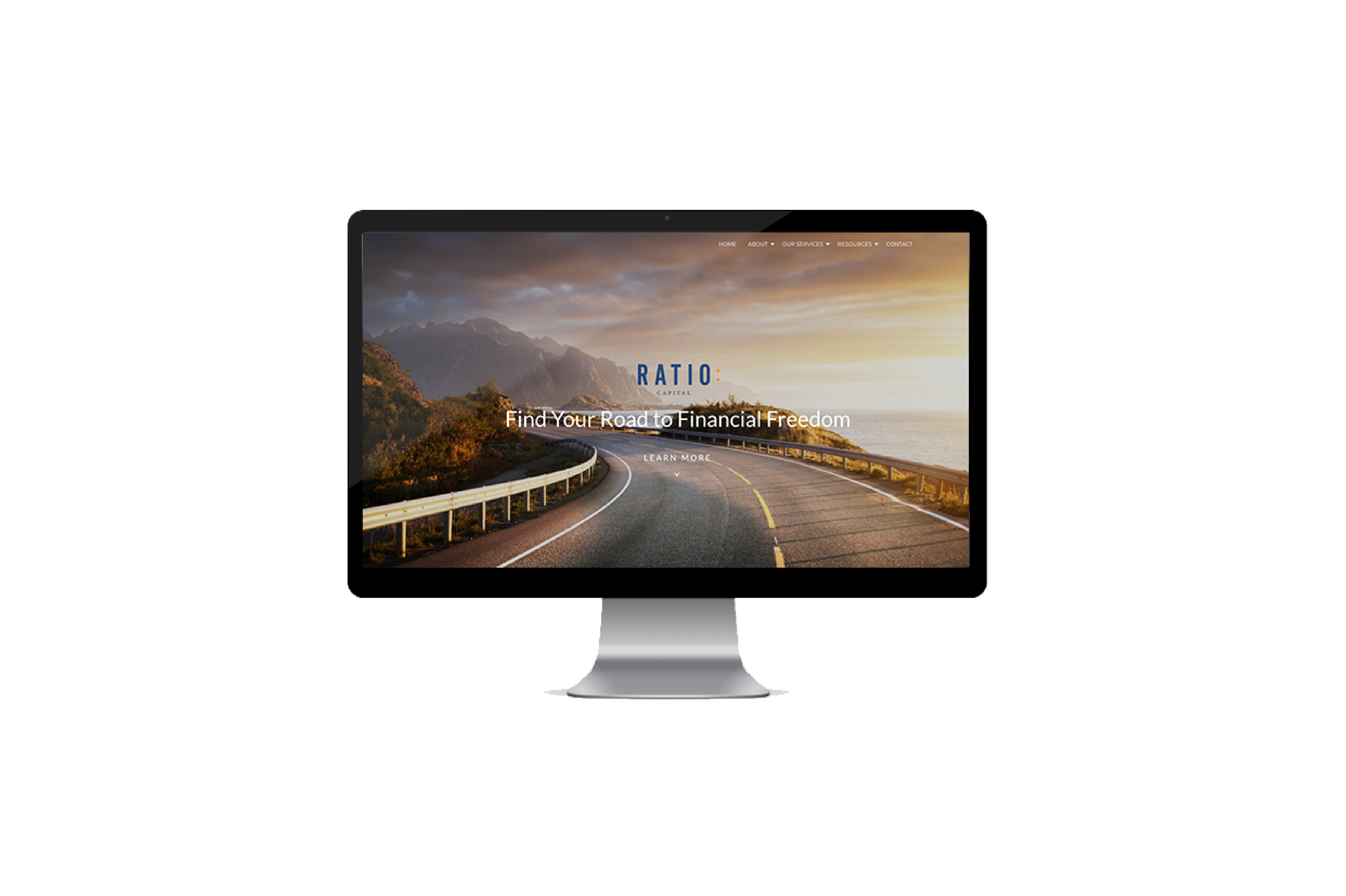
Ratio Holdings
The full-screen background image captures your attention while focusing on the company’s slogan that’s front and centre. The image works really well as it conveys the feeling of financial freedom, while complementing the branding with its simplicity and color scheme. As you scroll down the homepage relevant information is succinctly summarized in short sections, including “About” and “Our Business” with a “Contact Us Now” call to action that’s quick to follow.

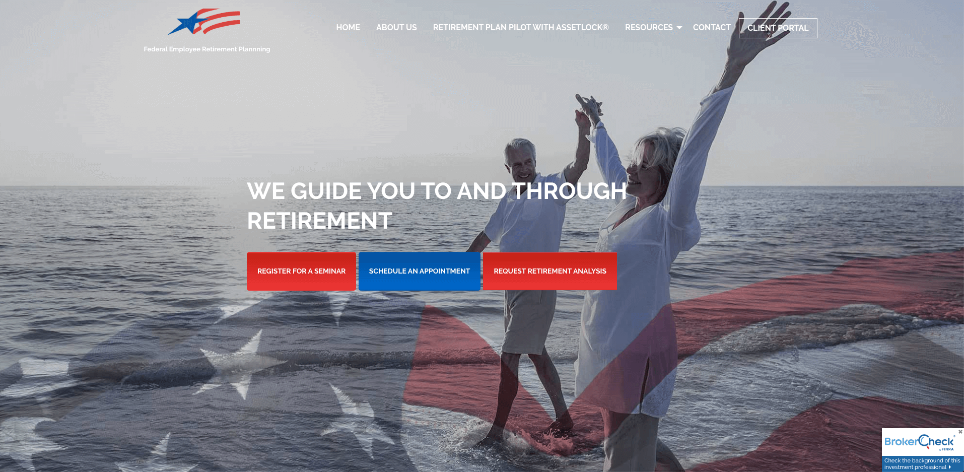
Federal Employee Retirement Planning
As the name suggests, this firm focuses on serving a very specific market and need; the Federal Retirement needs of United States Federal Agencies and Uniformed Services employees. The featured photography of a happy retired couple and a layered USA flag overtop perfectly identifies who may benefit by working with this firm. The slogan clearly communicates the value proposition with three specific calls to action front and centre on the hero banner.
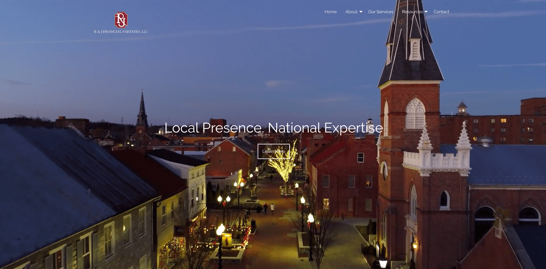
R&J Financial Partners
The looping video footage on the homepage banner features an aerial view of the firm’s actual location, making this website stand out among the rest. It’s a nice touch emphasizing the firm’s local roots in Winchester, VA. Beyond that, the site itself is minimal and easy to navigate. Providing only the necessary information and guiding the visitor to reach out for more information.
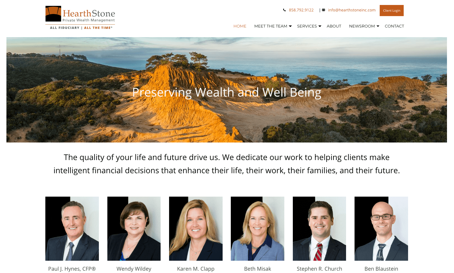
HearthStone
The team at HearthStone immediately takes the spotlight familiarizing the user with the people behind the business. The site’s design is clean and utilizes white space to arrange the content in a way that’s easy to interpret and navigate. A dynamic events calendar lets the audience know this firm appreciates and is invested in the success of its clients.
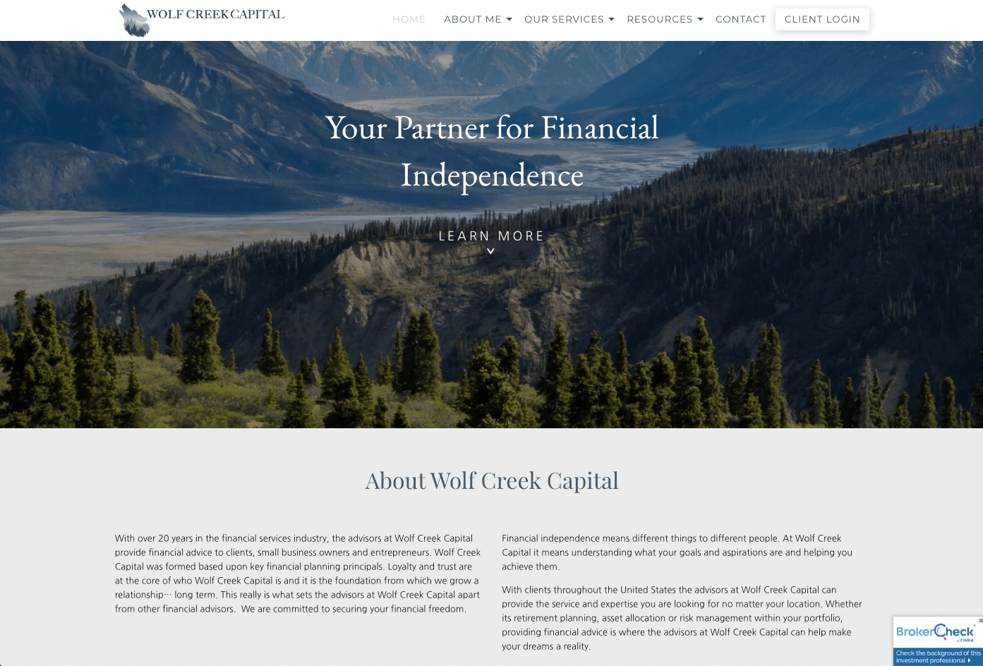
Wolf Creek Capital
Trust is built right from the start on this financial advisor’s website with visual previews of content from the blog greeting you on the homepage. The selected imagery complements the logo nicely and makes the whole site feel uniform. The site’s content is neatly organized and well laid out for the visitor to navigate through. Bonus points for connecting their LinkedIn profile on the contact page!
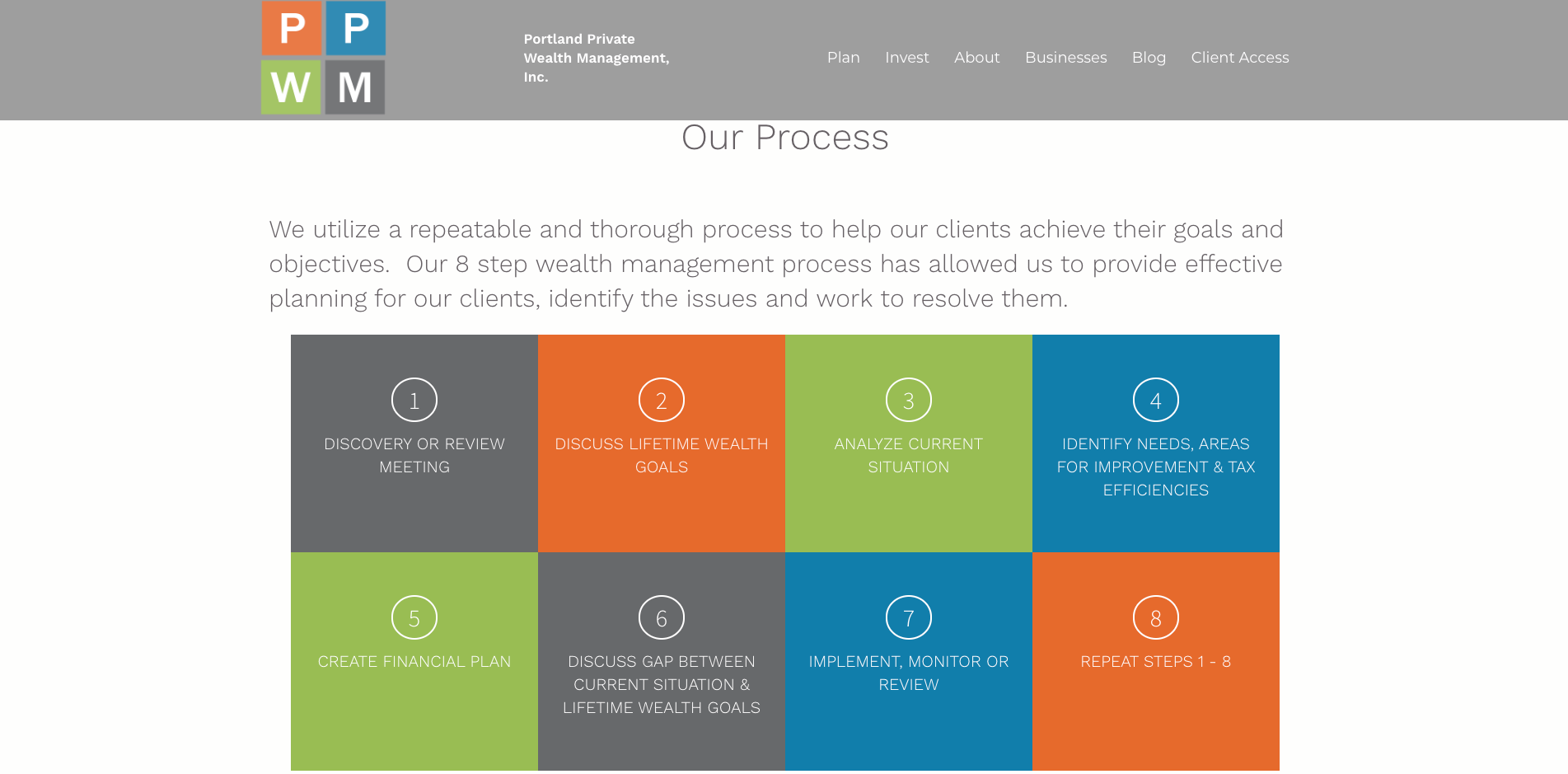
Portland Private Wealth Management
The design of this site maintains strong brand consistency by sticking to the brand colors and utilizing the logo’s block style to deliver content throughout the entire website. The imagery is representative of the firm’s company name and location; Portland, Oregon! The link to the blog lives right on the main menu making it easy for new and existing clients to find useful and relevant content.
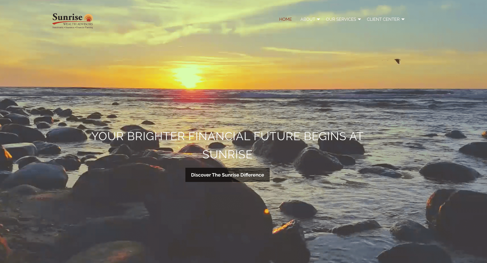
Sunrise Wealth Advisors
The beautiful live imagery featured on the homepage ties directly to the company name and integrates with the branding nicely. With only the essentials in the main menu, the overall design is clean and balanced.
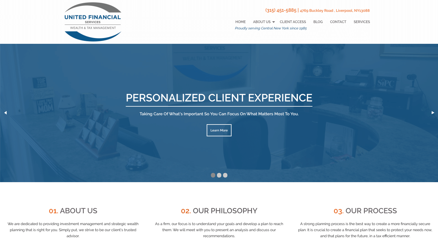
United Financial Services
A neutral color palette with a pop of bright orange is used perfectly to emphasize key information. Their process and services are well positioned on the homepage and the phone number attracts attention from above the top navigation. As you scroll further down the page, a preview of recent blog articles are featured showcasing the advisor's financial expertise.
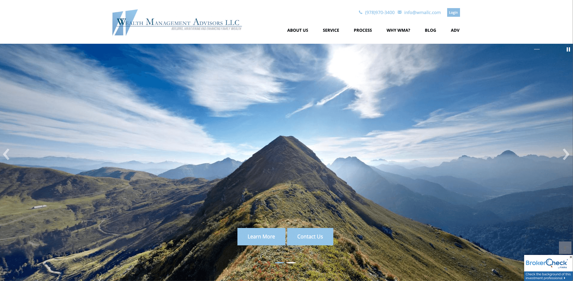
Wealth Management Advisors
Bold yet calming imagery on the hero banner makes this website stand out and the strategically placed ‘calls to action’ steer visitors to engage further. In addition, the brand’s soothing blue tone, which sends a message of calmness and trust, is applied throughout the site’s elements for a cohesive overall design.
CONCLUSION
We hope you are feeling inspired by the top ten financial advisor websites featured above. If you are considering a new website for your business, remember that a well designed site must first and foremost consider its target audience; keeping in mind WHO will be visiting your site and WHAT they will be looking for. This will impact the overall design and structure including the layout, menu navigation, calls-to-action, imagery, and tone of language. All of these pieces must come together so that it reflects your business and communicates your unique selling proposition.
Not sure where to start? At Advisor Websites we help financial advisors grow their business and enhance their digital marketing strategies with their own personalized website. Our platform offers a selection of effective and proven frameworks that are personalized to reflect your business and brand. Plus, all sites are automatically mobile responsive, compliant, and secure.
If you’d like to see our platform in action today:


.png)