
Mobile responsive websites are crucial to your financial advisor business.
Ever tried to load a website with your phone only to find a jumbled mess on the screen, or a button that can't be selected?
How likely are you to stay on that website?
Like most, you'd probably head back to Google and find a different, more user-friendly website.
That is what happens if a site isn't responsive (or mobile-friendly) and it could be costing you new clients.
By providing a mobile responsive online experience for your visitors, you're keeping your brand consistent across all devices, building trust with your target audience.
You're also making it easy and aesthetically pleasing for them to visit your site and find answers to the problem they are experiencing.
It is no longer realistic to forgo optimizing your website for mobile.
Especially in the world we live in today, with 92.1% of internet users accessing the internet with a mobile device and approximately 4.32 billion active mobile internet users.

However, you have to choose your website banner images properly if you don't want to lean on the help of a developer or designer to make sure that your website looks good on any device.
Images are one of the most frustrating aspects of responsive websites, specifically banner/full-width images.
These are most likely to break or not appear correctly on different screen dimensions.
So, why is this happening?
To understand this, we will explain what it means for your website to be responsive.
How Financial Advisors Can Choose Banner Images For Mobile Responsive Websites
Responsive websites “shrink” the dimensions of your website horizontally.
This means that while the website changes horizontally, everything on your website is also re-positioned.
This is called a fluid design.
Since responsive websites resize and change layouts depending on the device it's being presented on, it can be hard to see all the details of a website image if the page isn't responsive.
If a website doesn't look proper when a user visits the page, they will lose trust in the brand and continue their search elsewhere.
Banners are particularly hard due to being very large, and almost always full of detail.
Below we are sharing some best practices to follow when choosing a banner image for your website.
1. Ensure The Size Of The Photo Is Not Too Small
We recommend banner images for responsive websites to be 1024 pixels x 768 pixels for the best quality image.
While computer screens continue to get larger, and mobile device dimensions continue to evolve, a header width of 1024px is still one of the most recommended sizes.
You won't want to stray too far from these dimensions.
Anything less than this size (for either width or height) could result in a blurry image, however, anything larger could slow down your webpage speed.
You don't want your webpage to take too long to load, as website visitors will lose patience and look elsewhere.
2. Try To Pick Images Without A Focus
Choosing banner images which have no main focus, such as a landscape, is one of the best images to use on your website.
No matter the device, the viewer will be able to distinguish the image's details.
Since there is no focus, we can place the image without worrying about how the website will be formatted across various devices.
Here are some examples below: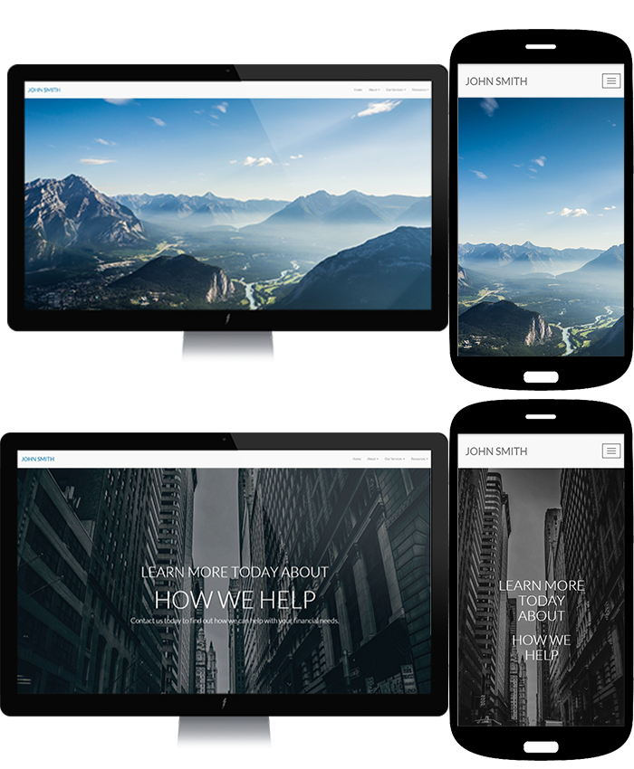
As you can see, the image shrinks horizontally, but since the landscape is so large, clients can still see what the background is.
However, there will be times when you want your banner image to have a focus. We'll discuss how to make that possible next.
3. Choose An Image With A Centered Focus
Let's say you would like a photo of a person, or an object on your website as a focus.
When using photos with a focus, we recommend keeping the main focus in the center of the image.
Since responsive banner images like to shrink horizontally, we lose a great deal of the sides (white space) of the images.
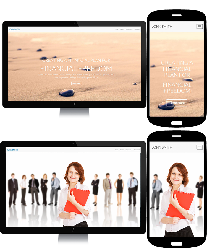
In the examples above, you can see the rock and the individual are in the center of the image.
This allows for a polished and enjoyable visitor experience.
4. Above All, Test Your Images
The best way to test your images is to try them out on your website.
Testing images will help you also understand what types of photos do and don’t work.
Once you upload a new banner image to your website, test out how it looks on your phone.
If you have a tablet, visit your website on that to see how it looks there as well.
If it doesn't look quite right or is taking too long to load, test out different images until you find one that works.
In Conclusion
Having a website that looks great across all devices is a necessary step in attracting your target audience and building trust with them online.
If your website images are cut off in different spots across different devices, it may signal to the visitor that you are not detail-oriented, or worse, that your website is spam.
Following the recommendations outlined above is an easy way to make your website banner images more responsive across devices without requiring the help of a developer or designer, however, if you're ready to take your website to the next level click here to connect with a member of our team.


.png)