We get asked often: so what are the best financial site templates for advisors? This is a question we are always happy to answer.
These templates shown below have all received positive feedback and are working quite well.
For us to call a spade a spade is the only way. Therefore we would argue the sites listed below are using some of the best financial site templates available on the web today.
Here are some of our best financial site templates:
#1: Berk Cleveland Rathmell Wealth Strategies
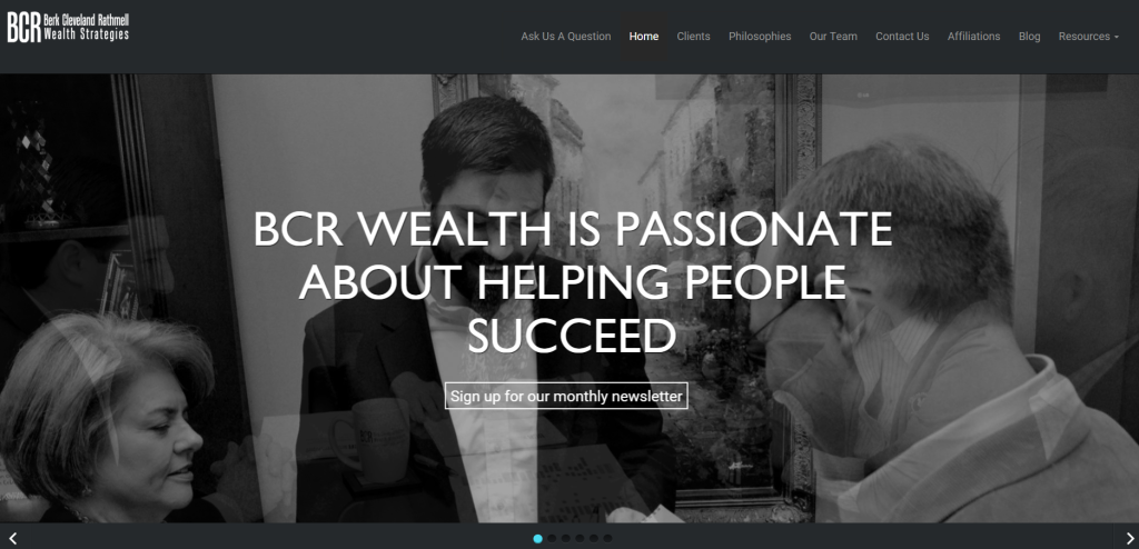
The BCR site is truly modern design impersonated. This site is responsive. The home page contains a built in scroll to all the important sections. Super simplified and sleek.
BCR's website displays some powerful responsive imagery. They use big slider hero shot images and short headline texts. This is a good way to grab attention. I know for 100% certainty that they are passionate about helping their clients. It has consistent messaging and therefore this helping attitude is clear to me because of it. They care and the website shows this.
This website does a really great job of directing viewers towards the next step. They provide clear call to action in the middle of the page with that "Sign up for our monthly newsletter." Take note of that.
They are running a blog section which is being updated with content.
The menu system on the right hand side of the site is modern. Following that up with some video content below the fold, one mouse scroll away. Speaking of video, the background video is also a very nice added touch. Many marketers are turning to this method.
Overall this is a beautiful site.

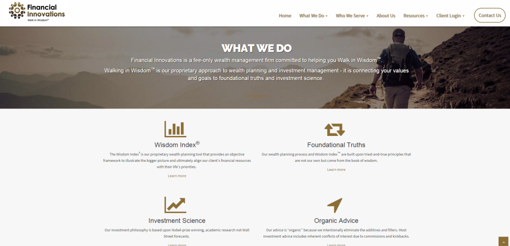
Financial Innovation is a sleek, responsive site. It is user-friendly and intuitive and very modern. The easy-to-find navigation bar at the top of the page allows users a few things. One is an instant call to action, with the 'Contact Us' button. Users will also know where they are at all times.
The search query on the right-hand side of the page allows web visitors to easily find something that may not be displayed on the homepage.
The images are all very nice. The contact capture forms are also easy to use. The blog has its own section which looks good and is navigation friendly.
The messaging is also powerful. "Are you walking in wisdom?" With the picture of the person on a leisurely sojourn up a beautiful hillside. It matches and it resonates.

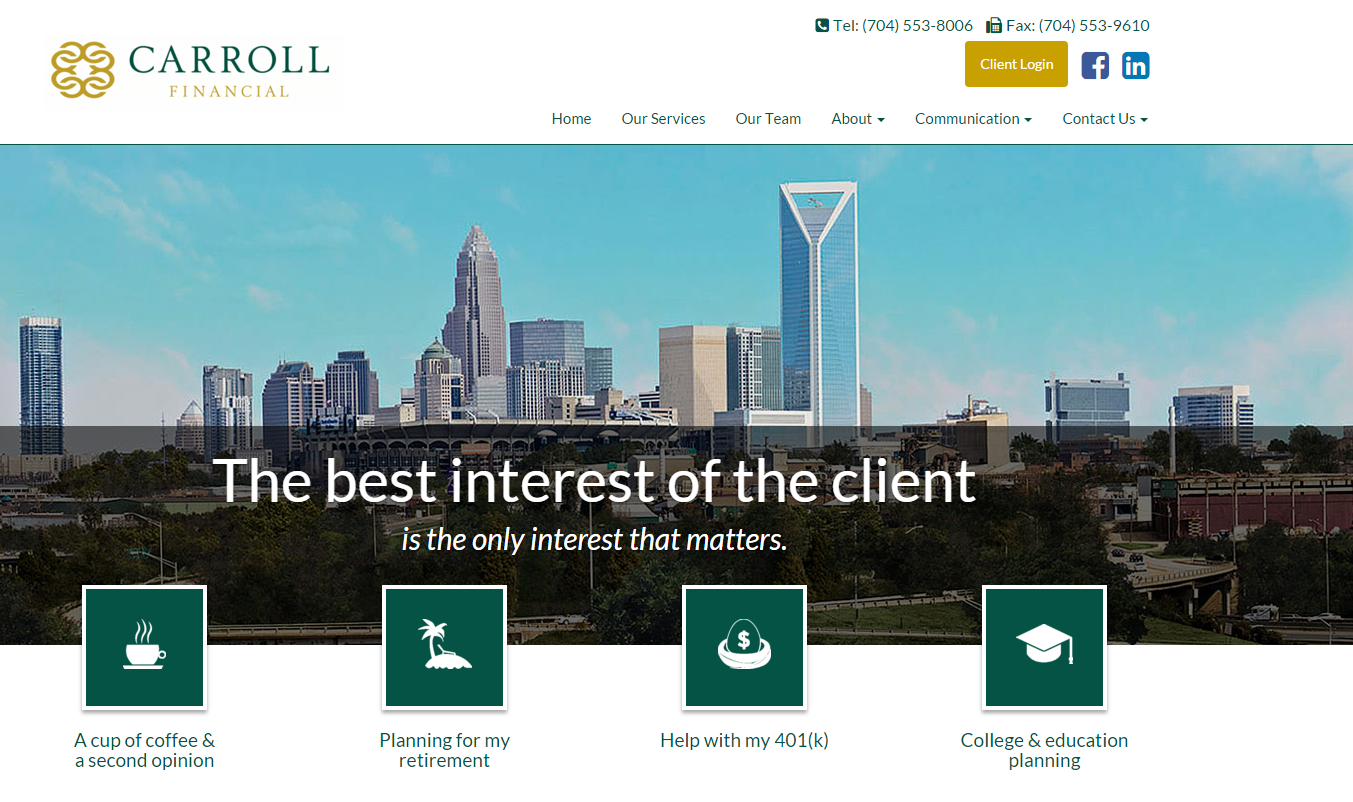
The Carrol Financial site is our Locarno theme.
It is simply to the point, responsive and user friendly. They use the 4 large button icons right in the middle. This is made for touch screens or other touch devices mainly. This is important because the growth of mobile and tablet use is rising year over year.
This site has clear contacts and call to action on the top right of the page. It also features some sharing buttons for social. All in all, this is one of our most popular themes among financial advisors for a reason.

If you like what you see, then don't hesitate to book a demo today with our experts. We will tell you all you need to know about SEO, design, content, social media and more.


.png)

