

Increase Conversions with the Right Website Colors
 The impact of website colors is often taken for granted. We tend to think of color as a means for aesthetic appeal or to simply breathe life into a website. You know...just for decorative purposes.
Although that can be the case, color decisions in design play a much larger role than we think.
The selection of colors used for a website ultimately determine whether the website will produce a desirable experience for its viewers or not. Color does more than make a website look good - it lays the foundation for an enjoyable experience for its viewers, thus leading to higher conversion rates.
Color and Usability
In addition to making a website look good, color can also help your audience use the website.
An important concept in website design is the use of color-coded buttons or sections to foster memorability and easy navigation.
Private Equity Partners does a great job at using color for navigational purposes by separating each of their financial services by different colors. It's important to also note that these colors used are associated to their logo, helping to build a cohesive look and feel to their site rather than using randomly selected hues.
In essence, color not only provides a differentiating factor for similar elements but can also help create a strong association between concepts, allowing important parts to remain memorable.
Color and Engagement
As color teaches people how to use a website, color can also increase engagement activities. Think of color as anchor points for the eye, focusing our attention on only the important elements of a website.
Ever seen CTA (call to action) buttons that are a contrasting hue to the overall color scheme of a website? Well, that's website designers doing color right - using eye catching (yet appealing) colors to pull viewers into the most important aspects of the site.
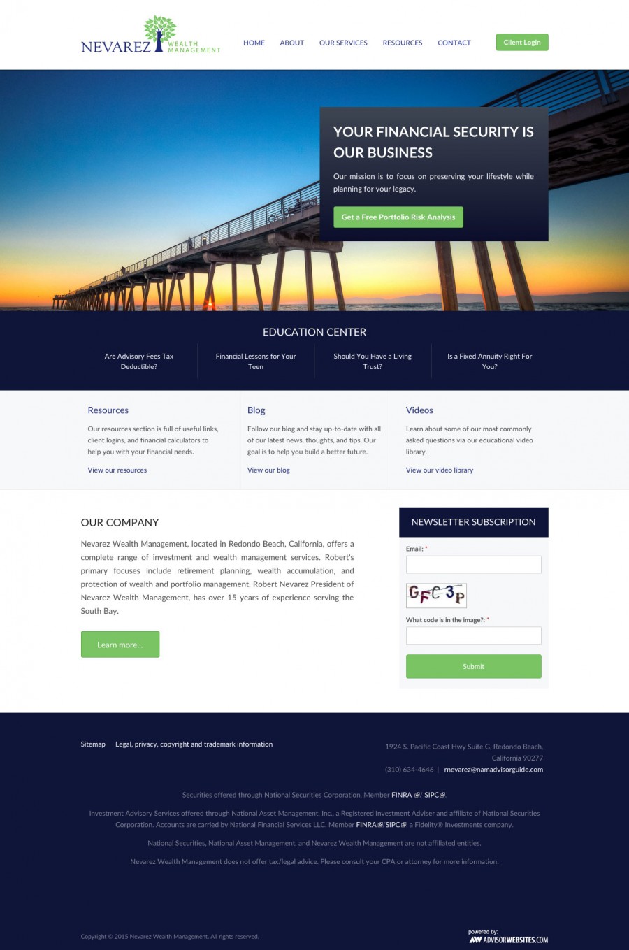
Nevarez Wealth Management uses a lime green against a blue color scheme for their CTAs to capture viewer's attention.
Color and Experience
Colors affect people emotionally and psychologically. For example, faint tints of green are sometimes painted on walls of patient rooms in asylums due to its calming effect while the color red is known to increase one's appetite for food. The point is, all colors in the color wheel contribute to an equal number of interpretations and symbolic associations.
Whether you decide to use a dark purple or a pale yellow for your website's color scheme, keep in mind that colors determine a user's experience and their overall impression of your brand as a whole.
Here are the key take-aways for coloring your website:
- use color-coded buttons or sections to foster memorability and easy navigation
- use colors that are eye-catching yet associated to your logo in order to create a cohesive design
- distinguish important elements such as CTAs with colors that contrast well to overall color scheme of the site


.png)