

If you have a website you might have heard of the terms "usability principles", "user experience/UX" or their equivalents at some point in time. That's because usability has become a huge commodity over the past few years - forming the very basis for a great user experience.
 Usability refers to a user-centered design. This means websites, from its design to its development, are focused around its target audience. Everything is mapped out to ensure mental models and goals are met - to ultimately build out a website that is efficient to use. With efficiency comes happy end users and thus higher conversion rates!
So here's the real question - how can we ensure our websites are easy to use and efficient?
The answer lies in applying usability principles.
Creating a great user experience takes a little bit of skill and a lot of detailed work. Those details are what your website viewers will notice time and time again; and they're easy to overlook. UX (user experience) design encompasses many related disciplines such as visual design, information architecture and usability analysis, to name a few. How you position a button, its color or the number of items in your navigation menu are all those little details that can determine the level of enjoyment viewers receive.

The point here is that if we aren't careful enough, we might find ourselves falling into the trap of marketing to the wrong niche or worst, to no one at all! A usable website is designed to meet user expectations. Applying usability principles can help steer you away from having a badly designed website (yikes!). Here are 7 basic principles of good website usability.
1. Don't make font sizes too small.
- Lengthier copies are harder to read in smaller font sizes. It's important that your website is legible. As such, don't make links, buttons, forms or other elements too small. Make sure that content blocks are anywhere between 50 to 85 characters per line.
2. Write clear link text.
- When creating a call to action, keep in mind that the link text should be short, simple yet descriptive. They should describe the destination they lead to while also being concise. Great examples of call to actions include, "Book a Demo" or "Get Your Free Risk Analysis".
3. Remove dead links.
- This point may be a given but the amount of dead links out in the wonderful world of websites will shock you. The definition of a dead link lies in the name itself. They are broken links that lead to a webpage which has seized to exist. No one likes dead links so it's a good idea to regularly check and maintain your website for them!
4. Proofread.
- Prospects not only appreciate a website that is easy to use, but also content that is of quality and credibility. The saying "content is king" gives validity to the fact that a website with a mediocre design but high quality content is much more tolerable than one with poor content quality and a good design. Proofread your copy especially when content is more important than the design that supports it!
5. Check its functionality.

- Test everything...and, really, I mean EVERYTHING! Common items to check for on your website include contact forms, search functions and log-in areas. Getting your website's target audience to further test these items might even help present problem areas you may have overlooked alone.
6. Keep webforms simple.
- Ensure you are using the correct form elements for the right tasks. For instance, if you are asking someone to select a few options, consider using radio buttons or a listbox.
- Remove unnecessary fields and provide descriptive labels for each input field to help users clearly understand what you are asking for. Hints and examples are great ways of doing so!
7. Make it easy to contact you.
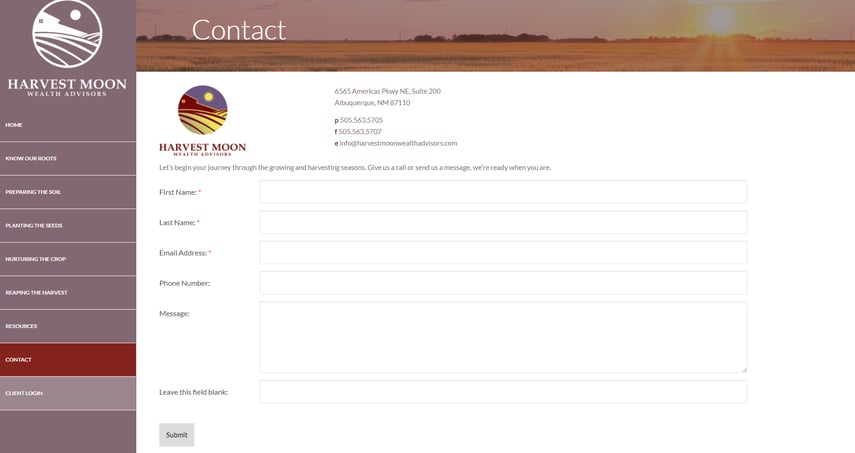
- After all the hard work of proofreading your content and establishing functionality throughout your website, it's important to create a funnel where prospects can contact you. After all, that is the end goal isn't it? If visitors want to get in touch with you and can't find any contact information, you will lose their interest and trust fast!
Usability is Earned
Good usability is achieved through constant updates, maintenance and testing. A website that provides an easy and pleasurable user experience is legible, functional, credible, predictable and relevant to your target audience. As you continue to apply these 7 design principles to your website, keep in mind that it's always a great idea to have someone else (preferably within your target group) test out the site on your behalf.
For any questions or concerns, please feel free to contact support@advisorwebsites.com


.png)