-7.png)
Introduction
Here at Advisor Websites, we pride ourselves on making the best websites in the financial industry. It's okay to toot our own horn once in a while, right? Well, if we're to make such an astounding blanket statement, we'll have to corroborate that. Below you'll be able to find some of our best websites, and we can break down some excellent components.
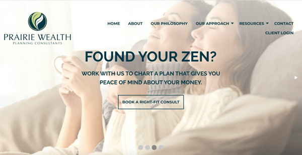
Prairie Wealth's website is clear, has nice images and not an overwhelming amount of information, topped off with a great colour scheme to match their logo. This site represents a lot of aspects of a website which are essential nowadays. People aren't interested in blurry images or too much writing, they want something simple, sleek and stylish. This site encompasses all those values!
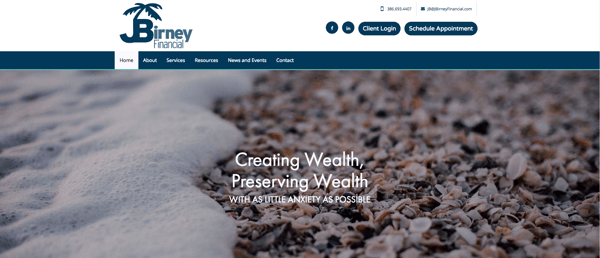
If you look through JBirney Financial's website, you'll notice it has a really great vertical menu. The important thing about vertical navigation, is that it's how people choose to explore a site on different platforms these days, especially mobile. The more clear and organized information you can have on the homepage, the better it is. This is because most people will choose to scroll down the page, rather than check out all the different subsections of a website through its navigation bar. By scrolling, you get to see the blog, the team, and a contact form, all in one convenient place!
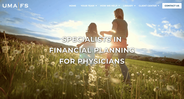
3) UMA FS
UMA Financial Services has a really awesome special feature which you'll instantly notice upon entering their site... our video feature! Not only is this incredibly eye catching for interested parties visiting the site, it also helps it stand apart from other sites. You may also notice the cohesive photos of the UMA team. We highly recommend that any and all employee photos be similar if not posed exactly the same way and in the same place. This just brings a heightened sense of uniformity and neatness to the site which people generally appreciate a lot.
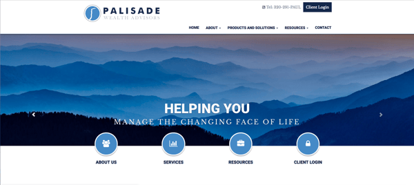
4) Pallisade Financial Advisors
Pallisade utilizes our Jericho theme very wisely. The first thing you see upon entering the site are the 4 icon bubbles which you can click on to go to different pages within the website. This way, clients can take the time to surf through the navigation bar at the top of the site, or they can go straight to the place they want to be through the buttons. This provides the double benefit of being useful, and contributing to the overall design scheme and aesthetic value.
Conclusion
We love to make beautiful, useful, and compliant websites for financial advisors all of North America. If these sites look good to you, or you're interested in learning more about us, book a demo today!


.png)