
The process of creating a great financial services website design is more than making it aesthetically pleasing; it requires the use of strategic language (your website copy) as well as content that will attract and engage your ideal client. In order to grow your business and acquire new clients, you need a website designed with your target audience top of mind.
Below is a curated collection of websites that best convey aesthetic design combined with a valuable user experience. Each of these sites have one thing in common: they have been designed to ensure that their brand stands out from the crowd and attracts their target audience.
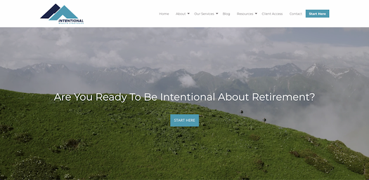
1. Intentional Wealth Strategies
Intentional Wealth Strategies is kicking off our top 10 list for its direct user experience (UX). So often, home pages can quickly become heavy with content, graphics, or call to actions (CTAs); with an intent to showcase all offerings. This is not the case with Intentional Wealth Strategies, they’ve kept it straightforward for their intended audience with an inspirational video banner combined with a single call to action.
Simplicity was key when considering their target demographic, as they provide services for retirees or pre-retirees who likely aren't digital natives and could potentially choose their firm over the competition, simply due to its ease of use.
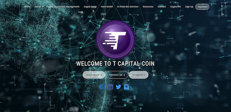
2. T Capital Coin
The modern cryptocurrency world is exciting, yet challenging for those new to this financial realm. For T Capital Coin, they've recognized the apprehension that can come with new clients when dipping their toes into trading cryptocurrencies and designed their homepage in response.
This firm understands that in order to build trust online, you need to put a face to the name - which is why they’ve set their primary call to action (CTA) to direct users to the ‘Our Team’ page, which includes headshots of their staff.
As an added bonus, they’ve provided value with their crypto swap calculator as a helpful resource for the digital native demographic.
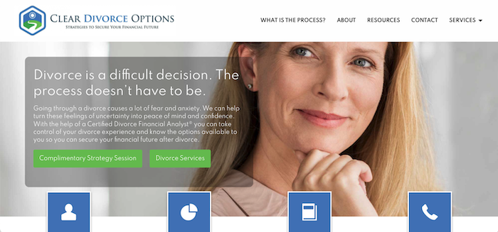
3. Clear Divorce Options
When it comes to the old idiom, “it does exactly what it says on the tin,” Clear Divorce Options doesn’t mince their words, they tell you exactly what they do and who they do it for.
From their company name to their website design, they express just how well they understand the delicate situation their ideal clients are experiencing by the copy they include throughout their website, most notably the headline, “Divorce is a difficult decision. The process doesn’t have to be.”
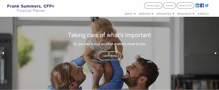
4. Frank Summers
Organizations can often feel disingenuous when marketing their services to support disenfranchised communities, but not for Frank Summers. On a high level, this website design follows key best practices - imagery and copy that represents how well he understands his target audience.
However, it’s the ‘My Story’ section that honestly and genuinely attracts his ideal clients. Frank Summers shares his personal experience as to why he specializes in serving the LGBTQ+, and special needs community, authentically building a high degree of trust between him and his future clients.
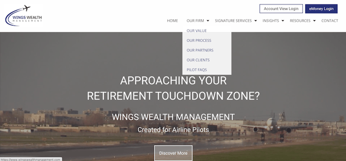
5. Wings Wealth Management
Wings Wealth Management does an incredible job of calling out their target audience as soon as they land on their homepage (pun intended).
Specializing in financial planning for retiring airline pilots, Wings Wealth Management uses aeronautical imagery, a video hero banner and designed assets (like their logo) to clearly represent the interests of their ideal customer. They've even taken it one step further in their targeting strategy by branding their FAQ page as ‘Pilot FAQs’.
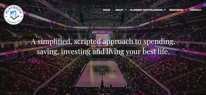
6. Playbook Financial Advisors
Playbook Financial Advisors attracts their ideal client through their company name and imagery, but they double-down on personalization with the visual language presented throughout their website. Targeted towards sports fans - specifically, individuals who love the strategies behind winning teams and how they implement them - they make use of the same jargon sports fans love and smartly apply it to their menu options and financial service offerings.
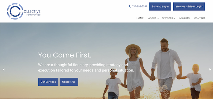
7. Collective Family Office
The Collective Family Office uses visual resources on their homepage to let their target audience know that they prioritize family values, even demonstrating via the logo their expertise in stewarding family assets across multiple generations of wealth.
They understand that their target demographic will not make the decision of who manages their wealth lightly, so they’ve included headlines on their homepage that connect with family values, such as, Our Guiding Principles, You Come First and We Make It Simple, in order to build that necessary degree of trust.
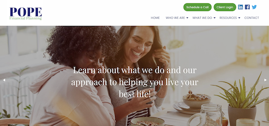
8. Pope Financial Planning
Pope Financial Planning welcomes their ideal client through warm imagery of women and mothers combined with their brand colours. Their goal is to empower and educate the financial literacy of women, represented on their website through the use of navy, which encourages feelings of power and authority and green, which is associated with prosperity and progress.
Pope Financial also includes a personalized video that empathizes with the complexities of financial planning for their target demographic, further establishing confidence between them and a potential client.
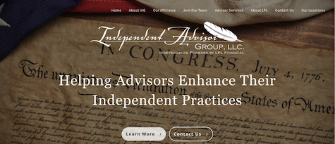
9. Independent Advisor Group, LLC
By keeping the homepage design simple, Independent Advisor Group, LLC demonstrates just how well they understand their target audience’s desire to save time when accessing the information they need. They use the banner image, the United States Declaration of Independence, in combination with the headline to clearly outline their value proposition and who they serve. Thanks to the two calls to action (CTAs), visitors are quickly directed to where they need to be.
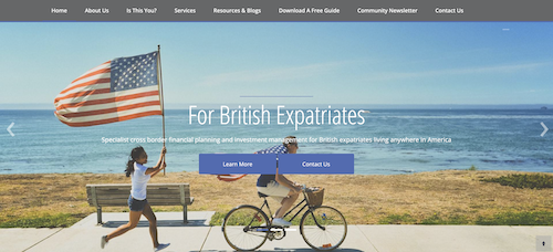
10. Taylor and Taylor Financial Services
Taylor and Taylor Financial Services execute on multiple design best practices that clearly target their ideal client, completing our list for top 10 website designs. Their banner carousel, headline, subheading and video asset leave no room for guesses on who they provide financial services for.
They included an 'Is This You?' menu option to support prospects in determining if they are the right fit and they further provide value via their digital assets, such as their free downloadable UK/US Guide.
Key Takeaways on the Top Website Designs for Financial Services
All of these websites have implemented one or more best website design techniques to ensure their site captures new leads and drives growth. Remember, a well designed website starts with defining your target audience, understanding their pain points and personalizing it to best fit their needs.
In summary, these are the key website design elements that will help you stand out from the crowd:
- Include visuals that communicate to your target audience
- Use language that’s simple and easy to digest
- Write headlines and subheadings that speak to your visitors needs
- Ensure user experience design (UX) is easy to use for the targeted customer
- Use clearly defined calls to action (CTA) laid out according to what your ideal client will be looking for
- Provide valuable and engaging content and resources that build trust


.png)