Trends in website design change on a regular basis, however it feels like the financial services industry has been slowly falling behind. I thought it would be interesting to feature 3 financial professionals who really took into considerations the evolution of technology, the popularization of larger widescreens monitors and the rise of mobile devices & tablets. The websites showcased below explored different ways to communicate their brand messaging to their target markets.
Here are some of the changes I have seen happening in 2011:
- Use of clean navigation and interfaces, making the user experience functional and intuitive
- Removal of clutter and unnecessary information on home page and secondary pages
- Use of light tone and color palettes, allowing the content to be easily read by most viewers
- Pixel perfect designs and use of clean and crisp icons/buttons, ensuring the website to be experienced equally on a mobile device or a 46 inch monitor
- Adoption of 960 grid system, which makes the designs perfectly fitted for an iphone
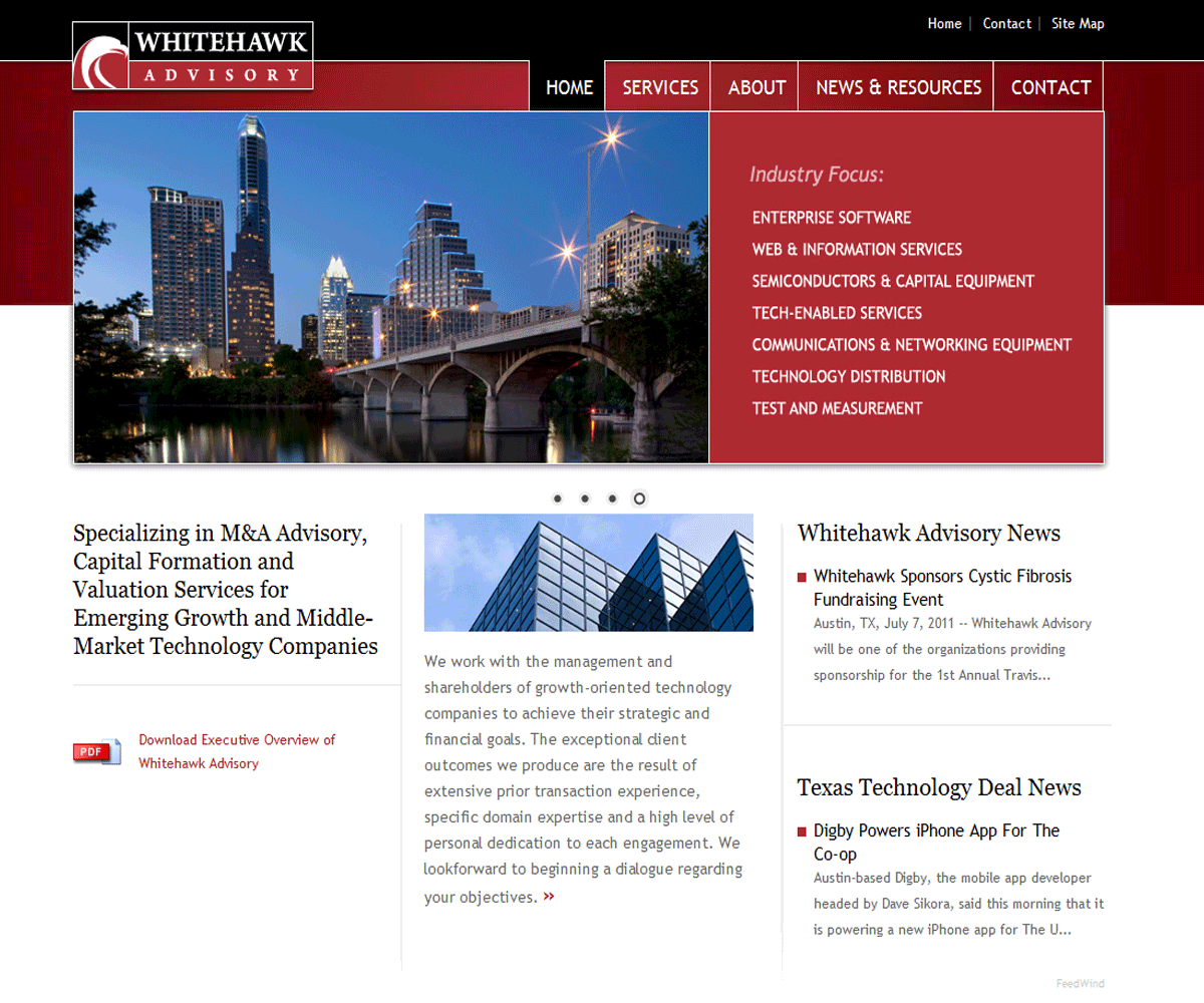
WHITEHAWK ADVISORY - www.whitehawkadvisory.com
Alex Klingelberger, Managing Director of Whitehawk Advisory, worked with a designer to create this beautiful two-tone website. He has opted for a rotating banner on the home page, a clean navigation and clear call-to-actions such as case studies and brochure downloads. His website also displays a feed on the resources page to keep his clients updated on high technology and deal news in Texas (feed provided by texastechpulse.com)
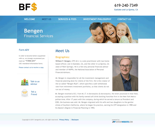
BENGEN FINANCIAL SERVICES - www.bengenfs.com
William P. Bengen, CFP©, is a sole practitioner, operating Bengen Financial Services out of Chula Vista, California. His new website has an easy to use interface, with clear navigation items and straight forward icons for relevant call-to-action.
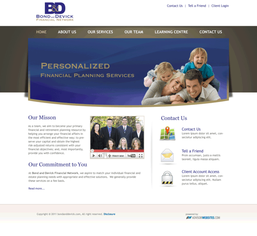
BONG & DEVICK FINANCIAL NETWORK - www.bondanddevick.com (old site)
The Bond and Devick Team is currently working with a designer to update their old website and give it a modern look and feels. The thumbnail below shows what their future website will look like once the production phase is completed and compliance has cleared it. Some of the updates include a YouTube video presentation of the team, crisp icons prompting users to take action (refer friends, login in to client account or fill a contact form) and a wide banner that takes advantage of large monitors.
MORE FINANCIAL ADVISORS' WEBSITES
|
|
|
|
|
|



.png)

