
If I asked you what the purpose of your advisor website is, what would your answer be?
In most cases, financial advisors want their websites to perform well, namely to increase conversion rates. This could mean anything from obtaining more sign-ups or subscribers to their financial products or services.
"Conversion" is an online marketing term that describes an instance of a visitor to your website performing an action that you deem to be desirable. For instance, if your website focuses on retirement, one likely conversion would be a subscription to a retirement savings plan.
Conversions are measured using a conversion rate. This is the ratio of all visitors to your website to the number of visitors who perform the desired action and, as you may have guessed, the higher this rate the better!

The question is, how do you turn a new visitor of your website into a loyal client? Let's find out by taking a look at what truly sells.
What Sells?
Step 1: Know what you're selling
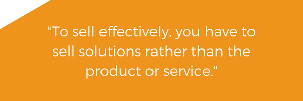
All conversions happen with the help of an effective selling strategy. To sell effectively, you have to sell solutions rather than the product or service. It may sound a bit confusing or perhaps counterintuitive but the truth is that customers are seeking fixes to their everyday problems. By focusing on the positive results and benefits that your clients will receive from using your product or service rather than its features, the easier it'll be to drive conversions.
For example, saying that your retirement savings plan contains 5 simple steps to follow doesn't tell prospects a whole lot besides its features. However, saying that the retirement savings plan is personalized to meet client needs does a much better job at highlighting its benefits.
Step 2: Break down the barriers
Once you know what you're selling, it's time to break down the barriers prospects will put up when determining how valuable your product/service is to them. These barriers are essentially reasons as to why visitors to your website shouldn't sign-up or subscribe to your product/service.
Possible barriers may include your lack of credibility as a financial advisor or even difficulties signing up on the site. Below are a few pointers on how to tackle these pesky barriers.
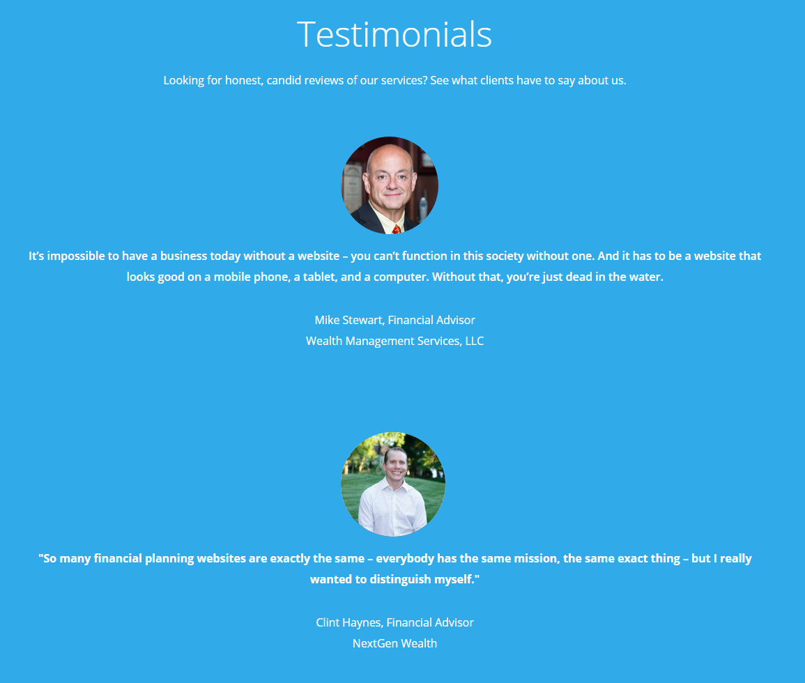
- Social proof is a psychological phenomenon that occurs when people aren't sure about the course of action they should take. Hence, they tend to follow along with what everybody else does. If everyone else is doing it, it must be good then right? We can use social proof to our advantage by adding testimonials to the homepage of our websites, advertising a popular ebook on college savings or simply adding our credentials (e.g. CFP) to our biographies.
- Let them try it out. Have you ever been given a sample of a product and ended up loving it so you purchased the product as a whole? One of the best methods of selling is to let people try it out. By doing so, you're allowing prospects to experience what you're selling which increases their likelihood of buying dramatically. The same can be applied to your financial website. Offering free whitepapers upon completing a webform, providing weekly blogs or an ebook are all great ways of letting prospects learn more about your services and expertise without any real commitment.
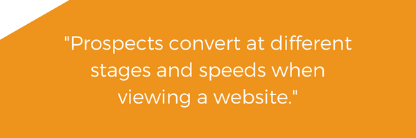
- Always be closing. The thing that most advisors forget is that prospects convert at different stages and speeds when viewing a website. If the "sign up" or "subscribe" button is placed in only one location of your website, you're essentially delaying the close of a sale. In other words, you risk dragging those people who have already made up their mind through marketing, when all they really want to do at this point is to sign up for your services. Write it down in your notebook or a sticky tab if you have to but you should always be closing!
- Keep webforms veryyy simple (note the emphasis on "very"). It's not enough to just have an abundance of closure opportunities - you also have to ensure that the way in which prospects sign up or subscribe to you is made most efficient especially when webforms are already a barrier in itself. The truth is no one enjoys filling out a webform. A good rule of thumb is to only ask for necessary information such as name, email and phone. This way, webforms are kept slim and quick. The last thing you need at the end of the funnel process is to lose a conversion due to a webform that's painful to fill.
Conclusion
Your website, instead of a salesperson, plays a key role in selling your brand, products and services. This places importance on the design of your website to create a seamless conversion funnel and although this may seem daunting, following the above guidelines can set you on the right path to success.
The key is in marketing the benefits of your product/service, then eliminating any barriers to convert. By providing social proof, enough closure opportunities, free trials and simple webforms, prospects will be more inclined to convert.
If you have any questions or concerns pertaining to this article, feel free to contact fional@advisorwebsites.com!