THE NEW WAVE
There are now 3.65 billion mobile users worldwide and half of them use smartphones to surf the web. That is a massive statistic.
This shift in the tectonic structure of web accessibility towards mobile devices has sent new waves of design strategy crashing through our industry. One large ripple effect is the way we approach responsive web design.
ORIGINS
After the initial introduction of smartphones and tablets, web designers were forced to start thinking differently about user experience. Approaches and advancements in adaptive design began to develop, and eventually, we reached a point called “graceful degradation.”
The term graceful degradation refers to the method of developing for larger web platforms first, then cutting and compacting down in size. We began with the desktop, adding all the latest and greatest functionality and design elements it took to optimize our sites for the typical web user.
Tablets and mobile devices were then developed out by stripping down to the essential content or simply resizing everything. They were an afterthought, created for the few that had a smartphone, but no access to a computer.
Functionality was spotty and content was sparse, inelegant, or lost in the downsizing.
THE BREAK
The leap in mobile web use over the past few years has forced the web design industry into a new standard of mobile design. Not only do we need to put more time, effort, and thought into the mobile designs, but in many cases, more so than desktop design.
“Graceful degradation” has given way to the approach we call “progressive enhancement.” We start our site structure at the smallest level, then build out each larger structure from there, adding functionality and additional content later, rather than stripping down.
We are just over the tipping point towards the mobile-first revolution.
WHY MOBILE FIRST?
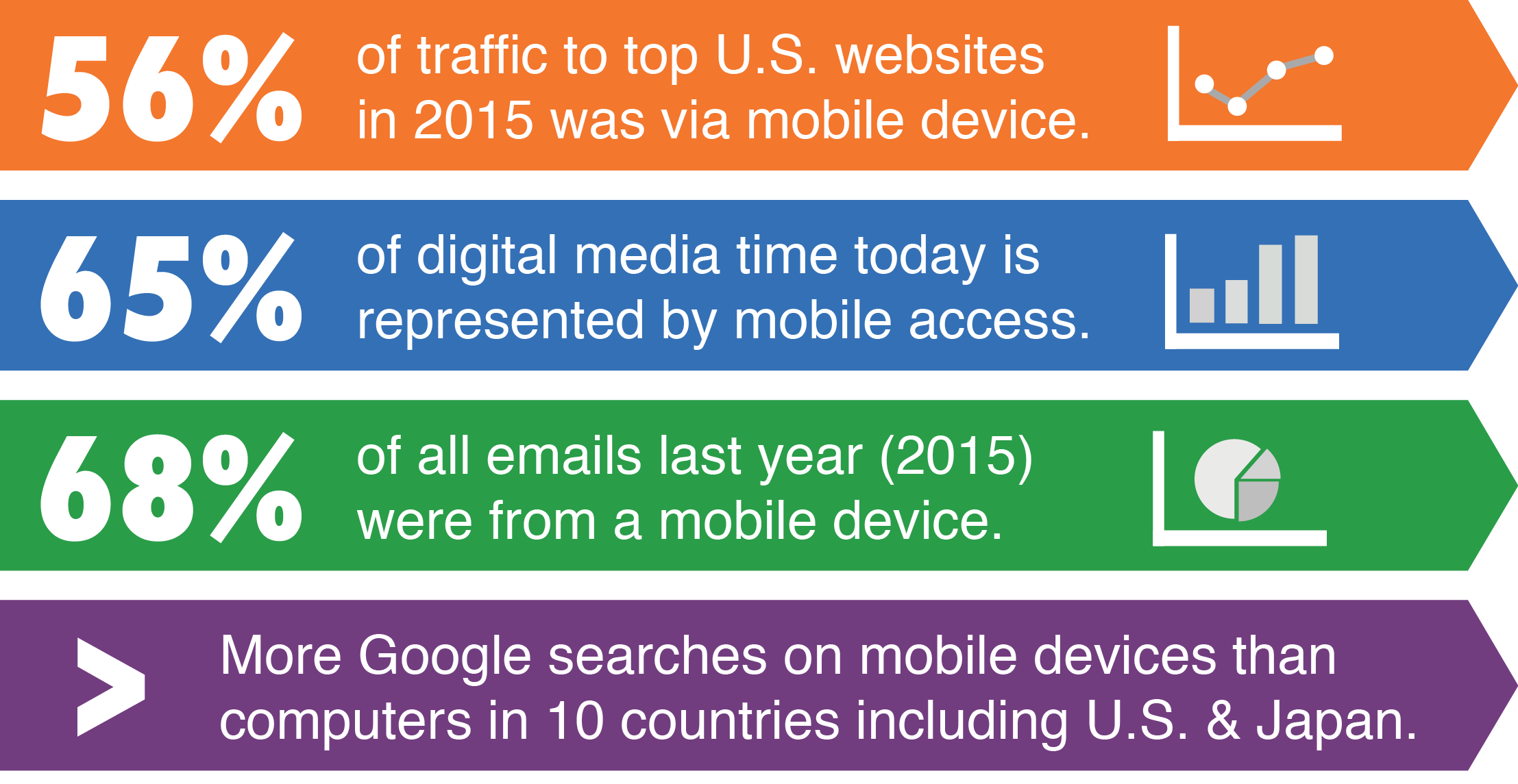
The statistics are in favor mobile-first design.
According to reports by Google, comScore, MovableInk, and SimilarWeb:
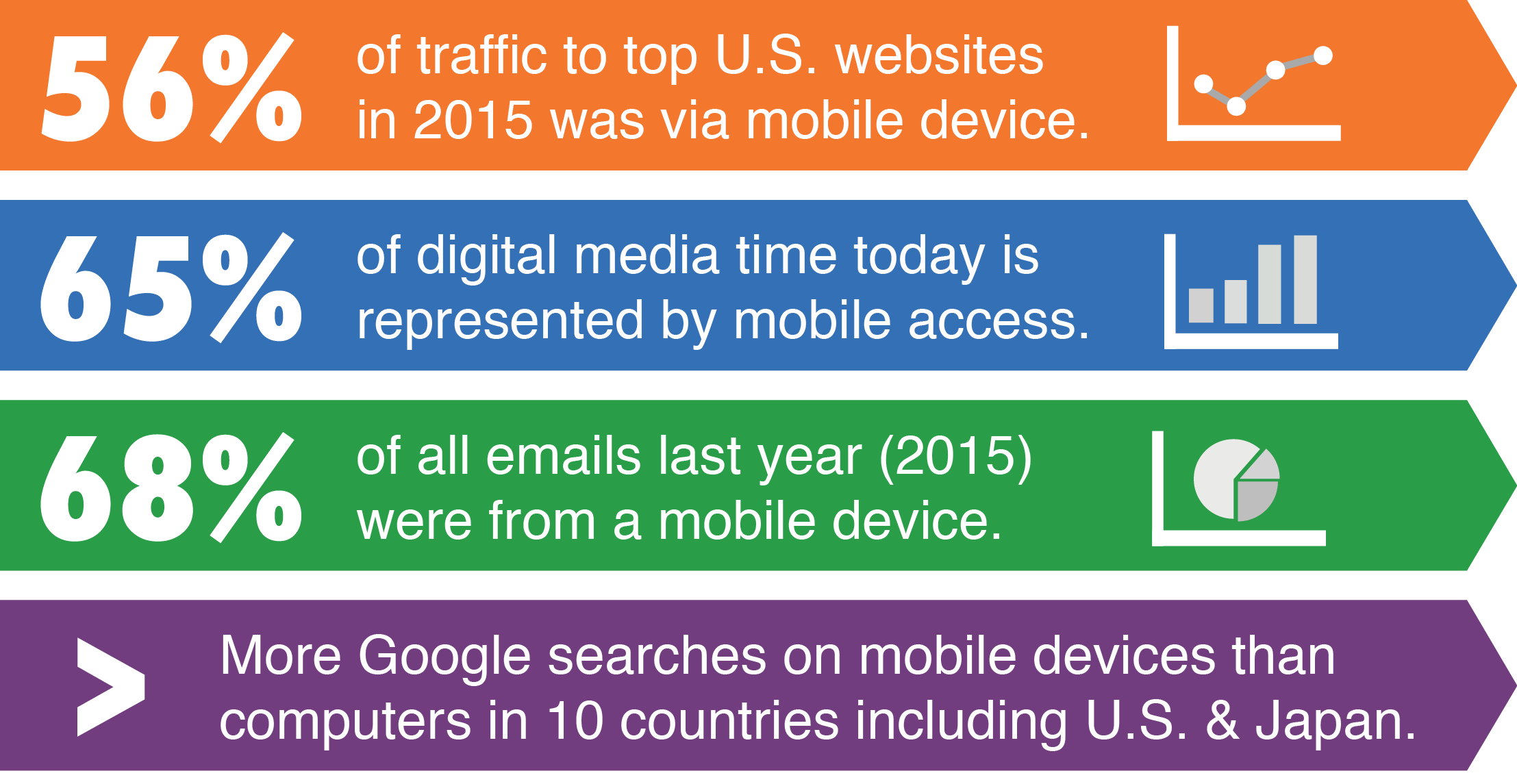
Google is in favor of mobile-first design.
Last year, Google officially rolled out their mobile-friendly algorithm, giving preference to sites optimized for mobile devices. What this means in the SEO and internet marketing world, is that mobile web design is incredibly important, not just from a user experience standpoint.
Your site’s search rankings have a direct correlation to how well the mobile version of you site is designed. So, mobile design is now an essential element to your business success, not just to the way your site looks.
THE PROS
Mobile-first is a content-first strategy. Designing on a smaller platform forces a focus on essential content. It forces us to choose only the most important information and condensing it into bit-sized pieces that can be consumed on small screens.
On the upside, this parallels optimizing sites for the present-day web user’s attention span. We consume information fast. We have to. We’re busy people. A mobile user should be able to get all the basic information they need about a product or brand within a few minutes on their phone screens.
Another plus to designing for mobile devices first, is that it’s easier to expand than condense. The last thing a designer wants to do after designing the structure, the content, and the functionality of a desktop site, is to start cutting all that hard work. And deciding what stay and what goes can be a painful task.
The good news is, there are a lot of advances in web development that specifically support mobile-first design. Media queries, for example, make it possible to use CSS3 to add rules of functionality for different screen sizes.
THE CONS
It’s hard to design on a smaller platform. Plain and simple, that’s the biggest downside to mobile design.
The smaller space puts limitations on content. Touchscreen technology renders hover functionality useless, so we have to rethink links. Fingers on a screen can’t work at the same level of intricacy as a mouse on a desktop, so anything “clickable” has to be made bigger, taking up even more space.
Web design already has a level of difficulty and it’s done every day. So, further complication isn’t a good enough reason to ignore mobile web design.
CREDIT
Emily Childers, author for Next Level Web.
Next Level Web is a trusted and experienced Internet Marketing company, proud to deliver marketing results with complete transparency. They specialize in Web Design, Search Engine Optimization, PPC Advertising, Content Marketing, and Email Marketing.
This article was originally written by Emily Childers and published here.